
James King
Foundation
FINAL MAJOR PROJECT
graphic communication
Project Ideas
-
Rebranding a Theme Park (Logo, Website, Park Map, Ride Logos)
-
Video Games (Poster, Cover, Logo)
-
Design a Phone (Brand Logo, Box, Adverts, 3D Phone mockup)
-
Make an App (New Social Media, Game)
-
Make Memes
-
Book about Memes (History, Guide for Boomers)
-
Design Bus / Train Map
-
Trading Cards / Card Game (Like Top Trumps) - for Theme Parks
-
New Monorail System for Bournemouth, Poole & Christchurch area, or Dorset as a whole. (Logo, Website, App, Maps, Signs, Contactless Card). To improve transportation around the local area. Make it more futuristic
Idea One:
Monorail
Something that continues to bother me is how rubbish the bus services are around Bournemouth & Poole; They are always late, slow & claustrophobic. My idea is for there to be a brand new transportation system around the area that could expand the whole of the county, or maybe even further. Monorails are very futuristic looking as well as being quiet and environmentally friendly, as they are electrically powered. The Monorail would be built above roads, so it won't get in the way of any existing buildings. For this idea, I will create a new company who would operate this monorail, similar to More Bus (Morebus.co.uk, n.d.), Yellow Busses (Yellowbuses.co.uk, n.d.), and South Western Railway (Southwesternrailway.com, 2017) etc. This would involve making logos, websites, signs for the stations, route maps, contactless cards, leaflets and an app. A new, high tech Monorail system would improve the local area by reducing congested traffic on the roads as more people would like to take the monorail. Therefore, with less cars on the roads, there will be less fuel emissions, which will help the environment.
Idea Two:
Theme Parks Card Game
I had an idea to make a card game, as it would last me ten weeks. I came up with the idea of making it themed to Theme Parks, which is one of my interests. The game would be very similar to Top Trumps (Toptrumps.com, n.d.), where you would pick a category of the ride's stats (speed, height, inversions etc.) that has the highest number and hope its higher than your opponents number of the same category. I like this idea as I love theme parks and would like to create a game similar to this. This idea has a few problems however, as I would have to use images of the rides from the internet, which wouldn't be my own work. The other problem is it doesn't have much meaning behind it, being just a fun idea that would only appeal to me and other Theme Park / Rollercoaster enthusiasts.
Monorail Research
Existing Monorail Systems

Walt Disney World Monorail
One of the most iconic monorail systems in the world is the Walt Disney World (Disneyworld.co.uk, n.d.) monorail system located in Florida, USA. The system has three lines: the Resort Line, the Express Line, and the Epcot Line. All three lines start at the Transportation and Ticket Centre (TTC). The Resort line stops at five stations; Magic Kingdom Park, Disney's Contemporary Resort, TTC, Disney's Polynesian Village Resort, and Disney's Grand Floridian Resort & Spa.The Express Line follows the same track and route as the resort line however only stops at the TTC and Magic Kingdom Park. Finally, the Epcot line stops at the TTC and Epcot. The system operates 12 "Mark VI" trains across the three lines. The trains can reach a top speed of 55 mph, but average at around 40 mph. The track length is 14.7 miles long and each train is 203 ft long.
Las Vegas Monorail
The Las Vegas Monorail (Las Vegas Monorail, n.d.) travels the length of the strip with stations at the major hotels. There are seven stations which are: SAHARA Las Vegas Station, Westgate Station, Convention Centre Station, Harrah's & The LINQ Station, Flamingo & Caesar's Palace Station, Bally's & Paris Station, and MGM Grand Station. This system uses 9 Bombardier Innovia trains and runs of speeds up to 50 mph.


Wuppertal Schwebebahn
This is a different style of Monorail, The Suspended Monorail, located in Wuppertal, Germany (Schwebebahn.de, n.d.). The Suspended Monorail could actually be better than the normal monorails, as they could be placed above roads, as to not get in the way of anything. This system utilises only one line but stops at 20 stations, and carries 82,000 people daily. Surprisingly, this system is 118 years old, opening in 1901. If a new modern version of the Suspended Monorail opened, it would most likely have a smaller support structure.
Idea Three:
Social Anxiety
I thought of this third idea later than the last two ideas. I was planning on doing the monorail idea but after reading articles about them, turns out most cities don't like them as they are too expensive. I have now had another idea to do with Social Anxiety which is something that I relate to. I like the idea of making a book with different people's thoughts and stories, as well as coping methods. One of the things that people who suffer with Social Anxiety can face is loneliness or not being able to talk to anyone, so this book could be a good alternative to read other people's stories or thoughts. Other ideas that could be good would be an app, website, daily messager.
What is Social Anxiety?
Social anxiety disorder, also called social phobia, is a long-lasting and overwhelming fear of social situations. It's a common problem that usually starts during the teenage years. For some people it gets better as they get older, although for many it does not go away on its own. It can be very distressing and have a big impact on your life, but there are ways to help you deal with it. Social anxiety is more than shyness. It's an intense fear that does not go away and affects everyday activities, self-confidence, relationships and work or school life. Many people occasionally worry about social situations, but someone with social anxiety feels overly worried before, during and after them. (nhs.uk, n.d.)
Symptoms
You may have social anxiety if you:
-
dread everyday activities, such as meeting strangers, starting conversations, speaking on the phone, working or shopping
-
avoid or worry a lot about social activities, such as group conversations, eating with company and parties
-
always worry about doing something you think is embarrassing, such as blushing, sweating or appearing incompetent
-
find it difficult to do things when others are watching – you may feel like you're being watched and judged all the time
-
fear criticism, avoid eye contact or have low self-esteem
-
often have symptoms such as feeling sick, sweating, trembling or a pounding heartbeat (palpitations)
-
have panic attacks, where you have an overwhelming sense of fear and anxiety, usually only for a few minutes
London Transportation
Primary Research


The London Underground
London Underground's history dates back to 1863 when the world's first underground railway, the Metropolitan Railway, opened between Paddington and Farringdon serving six intermediate stations. Since then the Underground network, affectionately nicknamed the Tube by generations of Londoners, has grown to 270 stations and 11 lines stretching deep into the Capital's suburbs, and beyond.
The development of London into the preeminent world city during the 19th, 20th and 21st centuries would not have been possible without the mobility provided by the Underground. (Transport for London, n.d.)
Tube Maps
We visited London on Tuesday 25th February 2020, where I had my first experience with the London Underground. We used the network quite a lot through the day which gave me lots of opportunities to take photos of maps and the experience of using the tube as a whole. From Visiting London, I will now also consider having this monorail system a train system like the tube, as well as making parts of it underground. I very much enjoyed using the maps of the tube to figure out which train and direction we needed to go in, and found it very easy after a while. The Underground maps are very clear and easy to understand, which is helped a lot by the colours for each line, as this makes it very clear to know which line you're on and which stops link to other lines. The main London Underground map has all 11 lines in one map, but when you board a train, you get a map of that line, which shows the stops, and connections to other lines.

Click each Image for more Research


The Tube is being upgraded...
In this official Transport for London video, the company announces new upgrades to the London Underground to make the system more efficient, reliable and comfortable. The biggest change is the introduction of 192 new trains to the Circle, Hammersmith & City, District and Metropolitan lines. These trains will have bigger capacity, air conditioning and will be completely walkthrough. These modern trains will also feature live updating screens which will announce which station is coming up next and if there are any delays. Another new feature that has already been integrated into stations on the Jubilee line, is the introduction of glass walls along the side of the station, that will feature doors adjacent to the train doors. This will make the stations a lot safer as it will prevent people jumping onto the tracks or dropping litter.
Semiotics


Semiotics is the study of signs to investigate the meaning of signs and how they communicate a message.
"There are three main areas which form what we understand as semiotics; the signs themselves, the way they are organised into systems and the context in which they appear." (Crow, 2010)
" In English speaking countries our four-legged friend is called a 'dog' whereas in France it is 'chien', in Spain 'Perro', in Italy 'cane' and in Germany it would be 'hund'. What this shows us is the relationship between the signifier 'dog' and the thing signified (picture of a dog) is a completely arbitrary one." (Crow, 2010)
"All that is necessary for any language to exist is an agreement amongst a group of people that one thing will stand for another." (Crow, 2010)
"A sign is something which stands to somebody for something in respect or capacity. It addresses somebody, that is, creates in the mind of that person and equivalent sign, or perhaps a more developed sign. The sign which it creates I call the interpretant of the first sign. The sign stands for something, its object." (Crow, 2010)
Three Categories of Signs;
-
Icon - Resembles the sign. A photograph could be described as an iconic sign as it resembles physically the thing it represents.
-
Index - There is a direct link between the sign and the object. Smoke is an index of fire.
-
Symbol - No Logical connection between the sign and what it means. They exclusively rely on the reader having learnt what the connection between the sign and its meaning. The Red Cross is a symbol we have learnt to mean first aid.
Three Levels for signs;
-
Firstness - The Sense of something, a feeling or mood.
-
Secondness - Level of Fact, the physical relation of one thing to another.
-
Thirdness - The Mental Level, of general rules that bring the other two together in a relationship.
Paradigm - "The two basic characteristics of a paradigm are that; 1. the units in the set have something in common. 2. each unit is obviously different from the others in the set.
Codes - "As we can see from these examples (Road Sign) some of the paradigms have a fixed number of units to choose from; the alphabet, the number of weights in a family of typefaces etc. These types of paradigms are made of codes which are called 'digital codes'. These types of codes are easy to recognise and understand as the units are clearly defined.


Competition
Transport Companies

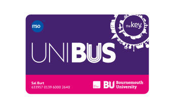
The origins of morebus can be traced back to 1916, when a bus company called Bournemouth & District Motor Services was founded; this became Hants & Dorset Motor Services in July 1920 as the network of routes expanded. The Southern Railway bought into the company in the 1930s and Hants & Dorset became state-owned in 1948. From 1 January 1969 Hants & Dorset became part of the National Bus Company, and in 1972 the bus livery was changed from the longstanding and familiar green to poppy red. Hants & Dorset was broken up into smaller units from April 1983, one of which was the Wilts & Dorset Bus Company whose area of operation included the present morebus network and sister company Salisbury Reds in Wiltshire. The Wilts & Dorset Bus Company was bought by its local management team in 1987, and has been part of the Go-Ahead Group since August 2003. The more brand, with its distinctive blue livery was first seen on the Poole to Bournemouth m1 and m2 routes in 2004 when an investment of £4 million was made in a fleet of 30 new Volvo single-deck buses, and has subsequently been rolled out across the network. Contactless payments were rolled out across the network in 2017; another major technological advancement and improvement to the customer journey after introducing Wi-Fi and USB chargers some years prior. (Morebus.co.uk, n.d.)

Click each image to see research about More Bus' Design style


The tramway predecessors of the company that was to become Yellow Buses started trading in July 1902. By 1906 the tramway system had reached its full extent, although further vehicles were added up to a maximum fleet of 131. In 1913, following a referendum, trams began to operate on Sundays afternoons and it wasn’t until 1926 that the first Sunday morning trams ran too. The first bus services started as ‘feeders’ to the tram in 1906 and were expanded only on this basis until 1930 when the bus fleet was doubled when the Borough expanded to take in Kinson and Holdenhurst. In March 2011 the ownership of Yellow Buses moved to RATP Dev when the merger between Veolia Transport and Transdev prompted RATP to withdraw from the shareholding in the capital of Transdev in return for a transfer of assets equal to the value of its equity investment (25.66%). Sixteen Transdev-Veolia companies and 6500 staff members joined RATP Group through its subsidiary RATP Dev, which focuses on managing transport network operations in France and internationally. We introduced a service linking Poole, Bournemouth and Christchurch over a century ago, in 1905, using open-top trams with wooden seats. Today we are still operating the same through route, but it is now faster, more frequent and uses modern luxury buses with leather seats, Wi-Fi and USB ports. (Yellowbuses.co.uk, n.d.)

Click each image to see research about Yellow Buses' Design style


South Western Railway is a joint venture between FirstGroup and MTR Europe, two of the world’s leading train companies. With about 235 million passenger journeys a year, the South Western franchise covers urban, suburban, regional and long-distance routes between London Waterloo and south western England, including Bristol, Exeter and Portsmouth. South Western Railway has some of the busiest routes in the country, operating nearly 1,700 services each weekday. Over the next 7 years, we’ll be investing in our network, our people and the community to deliver high quality, safe and reliable services which meet the needs of customers and the communities we serve. By December 2020, our £1.2 billion investment plans will bring longer, faster and more reliable trains with 52,000 more seats, across the morning and evening peak every day at Waterloo. On long distance services, existing trains will undergo a full refurbishment, improving comfort levels and returning to service looking like new. (Southwesternrailway.com, 2017)

Click each image to see research about SWR's Design style


Monorail Values
Five positive values that my Monorail company will have include:
-
Fully Eco-Friendly - Monorails are fully electric and produce no emissions, unlike trains or buses. Even electric trains produce some emissions.
-
Quick Travel - Monorails are a fast way of travelling, with the fastest monorail/train, the Maglev in Japan, reaching speeds of up to 373 mph.
-
High Capacity - Monorails can carry a lot of people. This depends on the amount of trains on the system and cars on each train. New monorail systems are completely walkthrough, with no gaps in the train, which means you can fit lots more people inside.
-
Efficient - If the system has enough trains, you can get one every couple of minutes, making it very efficient.

Typography
Futuristic Sans-Serif Fonts
Hover over each font to
view my thoughts on it
Conthrax Sb Regular
Bournemouth & Poole Monorail System
Aa Bb Cc Dd Ee Ff Gg Hh Ii Jj Kk Ll Mm Nn Oo Pp Qq Rr Ss Tt Uu Vv Ww Xx Yy Zz
This is a slick futuristic font that I quite like. It is a long drawn-out font that gives it a feel of movement like a Monorail does. I can easily imagine this font on the side of a high-tech monorail.
Good Timing Rg Bold
Bournemouth & Poole Monorail System
Aa Bb Cc Dd Ee Ff Gg Hh Ii Jj Kk Ll Mm Nn Oo Pp Qq Rr Ss Tt Uu Vv Ww Xx Yy Zz
This font is very similar to the above, however has some differences; the type is thicker and rounder. It also isn't as drawn-out as the above with it being more condensed
Nasalization Rg Regular
Bournemouth & Poole Monorail System
Aa Bb Cc Dd Ee Ff Gg Hh Ii Jj Kk Ll Mm Nn Oo Pp Qq Rr Ss Tt Uu Vv Ww Xx Yy Zz
This font has some really modern letters in it, such as the 'P, as it has a gap in part of it to make it one line. The M has also been very rounded off. I also like how the letters have one side more rounded than the other such as 'n'.
Neuropol Regular
Bournemouth & Poole Monorail System
Aa Bb Cc Dd Ee Ff Gg Hh Ii Jj Kk Ll Mm Nn Oo Pp Qq Rr Ss Tt Uu Vv Ww Xx Yy Zz
The biggest difference with this font is how some of the letters have shorter parts to them. This is evident on the letters 'e','s','y' & 'a'. This gives the type a futuristic feel that would definitely fit on the side of a monorail.
Neuropol X Rg Regular
Bournemouth & Poole Monorail System
Aa Bb Cc Dd Ee Ff Gg Hh Ii Jj Kk Ll Mm Nn Oo Pp Qq Rr Ss Tt Uu Vv Ww Xx Yy Zz
This font comes from the same family as the above, however its main difference is that it's a bit thinner. The letters are also more spread out from one another which may look different when on a monorail.
Nulshock Rg Bold
Bournemouth & Poole Monorail System
Aa Bb Cc Dd Ee Ff Gg Hh Ii Jj Kk Ll Mm Nn Oo Pp Qq Rr Ss Tt Uu Vv Ww Xx Yy Zz
This font is much thicker and bolder than the other ones above. Each letter is in full capitals which makes it stand out much more.
Expansiva Italic
Bournemouth & Poole Monorail System
Aa Bb Cc Dd Ee Ff Gg Hh Ii Jj Kk Ll Mm Nn Oo Pp Qq Rr Ss Tt Uu Vv Ww Xx Yy Zz
This is the most different font compared to the above, as it is much lighter and squarer than the curved rounded ones. I like how technical this font looks, and would be a good fit to incorporate into the logo, website or map.
Modern Sans-Serif Fonts
Eight One
Bournemouth & Poole Monorail System
Aa Bb Cc Dd Ee Ff Gg Hh Ii Jj Kk Ll Mm Nn Oo Pp Qq Rr Ss Tt Uu Vv Ww Xx Yy Zz
This font is very circular, and it doesn't stretch vertically that much. It is still a modern font and also quite a unique font. I find this font harder to see in a monorail company, however it still looks very nice.
Galyon Regular
Bournemouth & Poole Monorail System
Aa Bb Cc Dd Ee Ff Gg Hh Ii Jj Kk Ll Mm Nn Oo Pp Qq Rr Ss Tt Uu Vv Ww Xx Yy Zz
This is a very clear and simple font, that would work well as a sub text to anything on a website or logo.
Giorgio
Bournemouth & Poole Monorail System
Aa Bb Cc Dd Ee Ff Gg Hh Ii Jj Kk Ll Mm Nn Oo Pp Qq Rr Ss Tt Uu Vv Ww Xx Yy Zz
I really like this font as it is almost the middle between a futuristic and modern font, as it features the rounded parts of the sans-serif fonts but is also not as circular as some of the others.
Bronova Regular
Bournemouth & Poole Monorail System
Aa Bb Cc Dd Ee Ff Gg Hh Ii Jj Kk Ll Mm Nn Oo Pp Qq Rr Ss Tt Uu Vv Ww Xx Yy Zz
I like this font as it looks very modern but not ultra-futuristic.
Research Summary
From looking at the three transport companies, More Bus, Yellow Buses, and South Western Railway, I have learned that the brand design is very modern for all three. I've also learned that it's very important to make each company iconic and clear, as when you're boarding a bus or a train, you need to be able to easily see what company it is so people know whether to catch it or not. So for my Monorail Brand, I will need to come up with an iconic logo and colour scheme that is different to the three existing companies. The typography for the three companies all use modern sans-serif fonts, which is something I will most likely use for my brand, but I also need to consider the futuristic feel the monorail will have, therefore I will have a look at some futuristic-looking fonts. I have taken very heavy inspiration from South Western Railway as I really like the design aesthetic the company has. I love the colour scheme and the diagonal line pattern, which are two things I'm going to keep in mind when coming up with my brand design. Researching these three companies has been very helpful and inspiring as I now know the competition in the area.
Monorail Experiment
Improving the Alton Towers Monorail System
Before creating my final map and brand for the Bournemouth & Poole Monorail System, I wanted to create a trial run version where I could experiment with designs and typography, as well as to figure out any problems that might occur which I could fix beforehand. In real life, Alton Towers only has one monorail line that takes guests from the Main Car Parks & Hotels up to the Theme Park Entrance. I decided for this experiment, I would add three other monorail lines to expand and improve the transportation network of the Resort. (Alton Towers Resort: UK Short Breaks, Theme Park & Waterpark, 2020)
Initial Map Design Sketch
This picture to the right is a basic sketch for the monorail map. It shows the four monorail lines and the Skyride.


Initial Logo Designs Sketches
The picture to the left shows my initial logo ideas for the Alton Towers Monorail System. For this logo I wanted to make it look like a monorail so I drew the front car that monorails have, which is like a curved "nose shape". I also underlined the text and front car with a thick line that resembles the track for a monorail. This track, in some of the designs, is also supported by beams to add to the monorail feel of the logo.
Developed Map Design
I created this developed version of the sketched map on Adobe Illustrator, by using a screenshot of Alton Towers Resort on Google Maps. This map is accurate to the positions in real life, and also features the monorail maintenance area, that does exist in real life. As mentioned above, Alton Towers only has the Main Line (Green) & Sky Ride (Yellow) in real life, and I have added the Resort, Central & Eastern Lines myself. With this map, I have made the two main stations obvious which are the Park Entrance & Car Park Stations, by making the circles bigger. The map also features labels at each station, as well as a key in the top right of what colour each line is. At the bottom of the map, there are five columns with a list of the stations on each line.


Developed Logo Designs
From my initial sketches, I designed four digital versions of the Alton Towers Resort Monorail. They all feature the same style, but have a few alternatives like the track, supports and wether to have the main park logo in it or not. Eventually, I decided against the third logo (with the park logo) as it didn't feel as clean. For the final map design, I went with the top design as I think it worked the best with the space it needed to go in.
Final Map Design
After creating my developed map design, I wasn't fully happy with it as it didn't feel complete. The biggest change I did to this version of the map is the straightening out of the route lines, as in the previous map they were very wavy, but matched real life. In the London Underground, the map doesn't match the exact locations of the track and stations, but it is still clear where everything is, as well as it looking a lot better, so that is basically what I did to my map. Another big change to this map is the improvement of the station lists as well as a much simpler colour key, and the addition of the logo and opening times for each line. I've also kept the Alton Towers Logo in the top left of the map.


Map Experiment
In this version of the final map, I experimented with putting ride logos next to their nearest stations such as "The Smiler" and "Oblivion" logos at the X-Sector station. However, I decided against this as it just made the map look a whole lot more cluttered. I also tried to add in the short descriptions of each line in the big empty blue space however, I couldn't get it to nicely fit in, so I scrapped that idea.
Final Thoughts
My final thoughts on the above map are very strong, as I really like the design for it. It looks very clear and vibrant, and I think the colours compliment each other really well, especially against the white background. I really like the straight lines and sharp corners as it looks very modern and fits the monorail style. I want to do something very similar to this for my final Bournemouth & Poole monorail system as I think it works really well.
This page got too slow...
Bibliography
Websites
-
Morebus.co.uk. (n.d.). morebus - Frequent buses in and around Bournemouth, Poole, Christchurch, Ferndown, Swanage, Verwood, Wareham & Wimborne. [online] Available at: https://www.morebus.co.uk/ [Accessed 27 Feb. 2020].
-
Yellowbuses.co.uk. (n.d.). Yellow Buses - Filling Your Community With Colour. [online] Available at: https://www.yellowbuses.co.uk/ [Accessed 27 Feb. 2020].
-
Southwesternrailway.com. (2017). Buy Cheap Train Tickets | South Western Railway | The New Name For South West Trains. [online] Available at: https://www.southwesternrailway.com/ [Accessed 27 Feb. 2020].
-
Toptrumps.com. (n.d.). Top Trumps Universe. [online] Available at: http://www.toptrumps.com/ [Accessed 27 Feb. 2020].
-
Disneyworld.co.uk. (n.d.). [online] Available at: https://www.disneyworld.co.uk/ [Accessed 27 Feb. 2020].
-
Las Vegas Monorail. (n.d.). Las Vegas Monorail | Alternative to Shuttles, Taxis and Trams. [online] Available at: https://www.lvmonorail.com/ [Accessed 27 Feb. 2020].
-
Schwebebahn.de. (n.d.). Die Wuppertaler Schwebebahn: Home. [online] Available at: https://www.schwebebahn.de/en/ [Accessed 27 Feb. 2020].
-
nhs.uk. (n.d.). Social anxiety (social phobia). [online] Available at: https://www.nhs.uk/conditions/social-anxiety/ [Accessed 27 Feb. 2020].
-
Transport for London. (n.d.). London Underground. [online] Available at: https://tfl.gov.uk/corporate/about-tfl/culture-and-heritage/londons-transport-a-history/london-underground [Accessed 27 Feb. 2020].
-
Alton Towers Resort. 2020. Alton Towers Resort: UK Short Breaks, Theme Park & Waterpark. [online] Available at: <https://www.altontowers.com/> [Accessed 16 March 2020].
Books
-
Crow, D. (2010). Visible signs. Lausanne: AVA Publ.